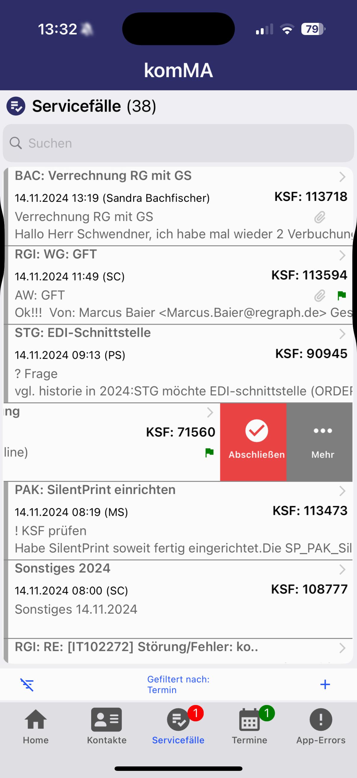
Since this is an app that is individually tailored to customer needs, only certain elements could be designed as permanent components. The menu bar leads to specific frames, each adapted to the user's requirements. An example of this is the “Service cases” page, which offers an integrated feature: The status of orders is visualized using color coding, so that it is immediately clear whether they have already been processed or are still open.

design concept

I finally decided on a reduced design that combines the company name with minimalist elements and thus ensures a high recognition value. The logo can be flexibly integrated into various design concepts and the color can be easily adapted to other projects.

I finally decided on a reduced design that combines the company name with minimalist elements and thus ensures a high recognition value. The logo can be flexibly integrated into various design concepts and the color can be easily adapted to other projects.

the icon

the icon

details

details

details

The top priority was to seamlessly integrate individual user requests. Both employees and employers use the app and need a clear overview of their tasks at first glance.

The top priority was to seamlessly integrate individual user requests. Both employees and employers use the app and need a clear overview of their tasks at first glance.

The top priority was to seamlessly integrate individual user requests. Both employees and employers use the app and need a clear overview of their tasks at first glance.

2022-2023


ux/ui design

app design


project for komMA Software AG


an app design especially for komMAs customers


komMA


komMA


komMA


artist & designer

You found Mia's hiding place… of course she can't be missing on my website :D

get in touch with me:

last update march 12, 2025 © 2025 nina miriam s.


CONNECT

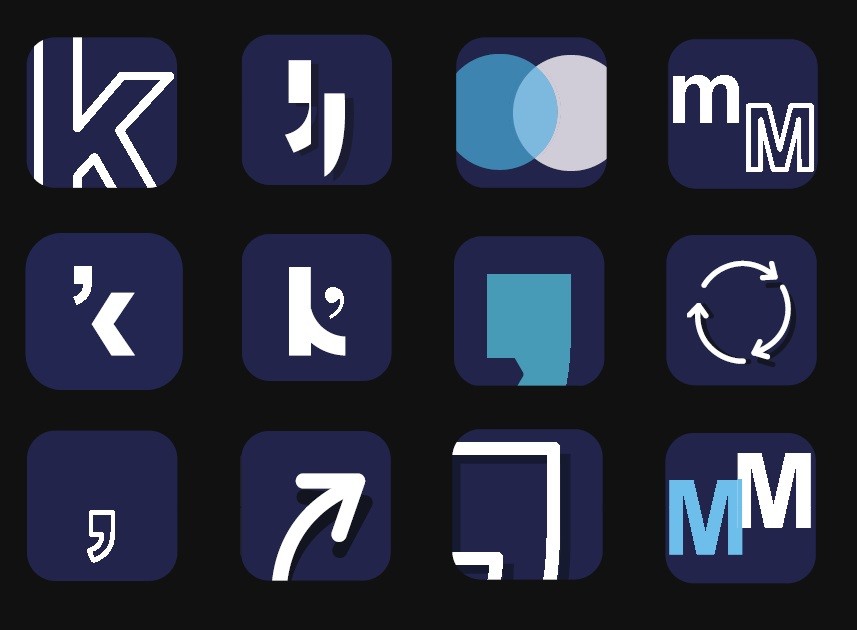
app icon development

... This was achieved through the targeted use of colors, markings and icons in the design. Additional customization options via separate tabs make it easier for users to use and increase efficiency when using the app.

... This was achieved through the targeted use of colors, markings and icons in the design. Additional customization options via separate tabs make it easier for users to use and increase efficiency when using the app.

get in touch with me:

last update march 12, 2025 © 2025 nina miriam s.


CONNECT

artist & designer

last update march 12, 2025

© 2025 nina miriam s.


CONNECT

get in touch with me: